

The end of design
Or how Apple's Liquid Glass hates its users

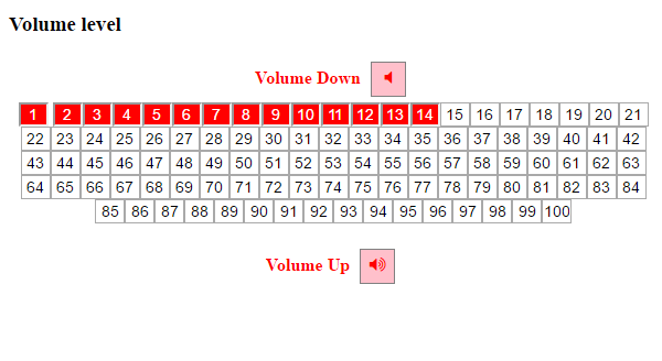
A volume control you have to tilt like a spirit level; one where you have to shout to set the level; another that uses a digital air pump to keep the loudness static — these are the design jokes that predicted the state of our digital world.
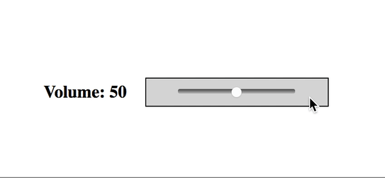
It began on Reddit, around eight years ago. A group of designers and developers competed with one another to create the worst volume user interfaces possible and, by god, they succeeded.
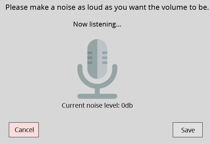
The memes spread and entered internet lore. In a way, they’re foundational to a specific type of online humour, one where nerdy knowledgeability and irreverent creativity cross over. In other words, they’re very xkcd-coded.
In some senses, it feels that this corner of the internet was washed away with, well, whatever the hell’s going on with online communities these days, but despite all that, the trend (which we’ll name the Worst Volume Control UI Experiment) has a gem-like kernel that’s still frustratingly relevant today.
The Worst Volume Control UI Experiment stands the test of time because it elegantly and effectively highlights the danger of design for design’s sake. A regular volume slider works. It’s a nigh-on perfect bit of design: it’s functional, accurate, and easy to understand. In other words, the Worst Volume Control UI Experiment is an exercise in fixing what ain’t broke.
Which leads us on neatly to Liquid Glass, Apple’s new design language launched with the new OS 26 overhaul. And, pals, it didn’t change for the better.
Because this is that sort of piece (and I love a little historical burrow) it’s time to waltz into the past of Apple’s design language.
When the iPhone was launched, Apple was in bed with skeuomorphism, a type of design in which a digital thing looks like the actual thing it’s meant to be. For example, a camera looks like a camera, rather than an interpretation of one.
Sidenote: For a nice bit of information, in Greek skeuos (σκεῦος) means “container” or “tool,” while morphḗ (μορφή) means “shape” or “form.” So if you want to look at it that way, skeuomorphism is the containing of a form.
The easiest way to understand skeuomorphism is through a comparison:
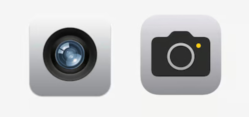
Nothing is static though. While skeuomorphism was all the rage when Apple released the iPhone, it became stale as the years dragged on. In 2013, iOS 7 dropped and the company broke from skeuomorphism. Gone were 3D, realistic-influenced designs and, in their place, came a more minimalist and flatter approach. Whether you see it as Apple influencing design as a whole, or it simply being the biggest company moving away from 3D digitalism, this created a sea change in UX design.
This shift was discussed by Duncan Nguyen on his Medium page:
[iOS 7 and flat design] pushed designers to focus more on content and how it serves the user’s goal. Visuals took a back seat, and suddenly what you were reading or doing mattered more than how the interface looked. Content moved to the center of the stage, and that mindset stuck around, for better or worse.
This was how Apple approached design until Liquid Glass.
In many ways, tech design is simply a pendulum, swinging between 3D and flat. Over the course of about a decade, we’ve gone from the skeuomorphic design of early iOS and much Windows software to the minimalism of flat design and now we’re swinging back towards 3D. This has been hinted at in recent years, with more depth and shadows being added to the operating system, but with Liquid Glass Apple is fully back in the 3D game.
The video above gives a decent insight into the approach, but the easiest way to sum it up is that Apple is influenced by glass and wanted to make a fluid operating system that mimicked it. According to Craig Federighi — senior vice president of software engineering — the influence for this shift came from the Vision Pro.
So I would say the most obvious inspiration is visionOS, which uses glass, and you say, ‘Well, why did visionOS use glass? Well, glass is a material that allows interfaces to sit in the context, in this case, of a room, and feel like the chrome [or frame] — that is, the glass — is somehow consuming kind of less space. It’s allowing more of the context to come through. That was very powerful in the concept of visionOS.
Fluidity, change, and cyclicity are the bedrock of creativity, with industries constantly in communication with the past. There’s nothing wrong with a return to 3D aesthetics by itself.
The problem is Apple shat the bed with Liquid Glass.
Sure, having a UI that’s influenced by glass on something like the Vision Pro makes sense — it’s a headset that puts information literally on top of the world, after all — but the same isn’t true on other hardware. Just look at what happens to the Liquid Glass aesthetic on iOS:
Since iOS 7 — and as Nguyen pointed out — content has largely been at the forefront of Apple’s design language. It’s not been perfect, but the idea that information is important has been central. Yet things have slipped — and OS 26 and Liquid Glass is an inflection point for Apple adopting a design-for-design’s-sake approach.
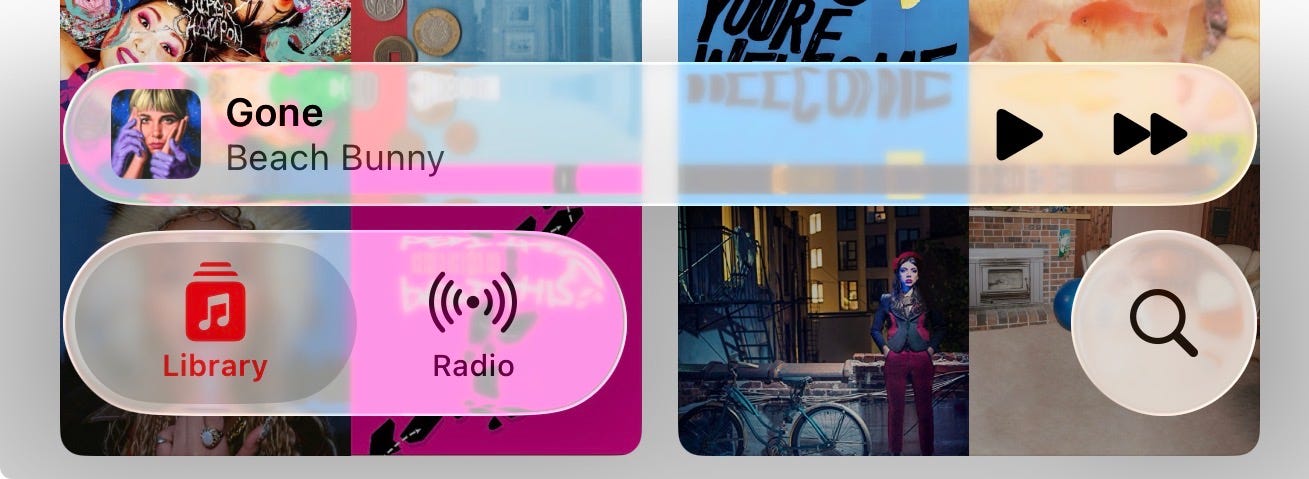
And if I was going to sum up this move with one element? One thing that embodies this ideal? The element that inspired this entire piece? Well, that’d be the new volume control on the macOS Music app.
War crimes have been committed that were kinder than this.
Back in the Glorious Before Times, there was a volume slider on the macOS Music app. You would move this up and down to change the volume. Elegant. Simple. Timeless. Then came the change: with the newly updated app you need to click on a button to reveal the volume slider to alter the volume.

Yes. That’s right. Eight years after the event itself, Apple finally entered the Worst Volume Control UI Experiment.
This is a decision driven only by the least charitable definition of design and is part of a wider suite of pointless changes in the Music app. Another, for example, is the player controllers moving from the top of the screen — where they’ve been basically since the birth of iTunes — to the bottom where it sorta irritatingly floats over important information. Even better, the area these controls used to be is now a predominately blank space. Sick. Sick sick sick. Sick.
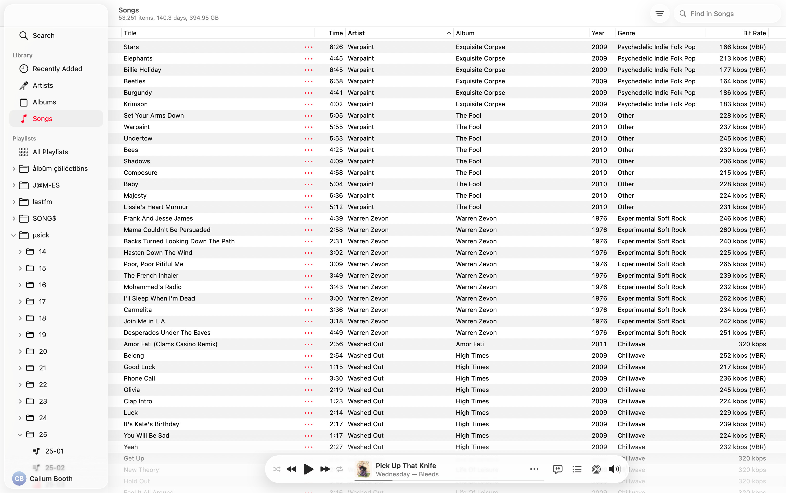
And this is what it used to look like:

The only rational reason for this is that Apple wants the computer app to look more like the iOS version. Having controls at the bottom of a screen on a phone makes sense: that’s closest to your fingers. But that’s not true on a computer. These machines draw your eyes upwards and can be easily navigated with a mouse. It’s why browsers or word processors or any other bit of computer software you can name have the majority of important aspects at the top of the display.
Removing a volume slider on a phone makes slightly more sense because your fingers are already on top of a volume button, something that’s not true on a computer — especially if you’re using external speakers that aren’t tethered to the system sound.
This, though, is besides the point. The fact is I’m in utter shock that Apple is putting extra steps in front of a fundamental task. Making me click on a button before changing volume is a pig-headed, user-hating approach to design that’s repeated in a myriad of ways across the whole Liquid Glass rollout.
What we’re seeing is dogma in action. Liquid Glass isn’t a regular pendulum swing between aesthetic trends, it’s not something that’s meant to make our lives better or easier, instead it’s Apple doing what it wants rather than what its users need.
The company wants the same app on a MacBook, an iPhone, and the Vision Pro to look the same simply because it wants them to look the same. They’re different platforms with different needs, but Apple is only interested in creating a brand experience.
So fuck me, right? Fuck me wanting to change the volume normally. Fuck me for having the audacity to buy a MacBook. Fuck me? Fuck me fuck me fuck me.
Apple doesn’t care and I’ll just suckle up what I’m given: volume control that’s a meme instead of a feature.
![Screen Recording 2025-09-26 at 10.37.53.mov [optimize output image]](https://substackcdn.com/image/fetch/$s_!seuU!,f_auto,q_auto:good,fl_progressive:steep/https%3A%2F%2Fsubstack-post-media.s3.amazonaws.com%2Fpublic%2Fimages%2F18fc6a96-40e9-4ceb-9926-04a02faefd9c_800x507.gif "Screen Recording 2025-09-26 at 10.37.53.mov [optimize output image]")